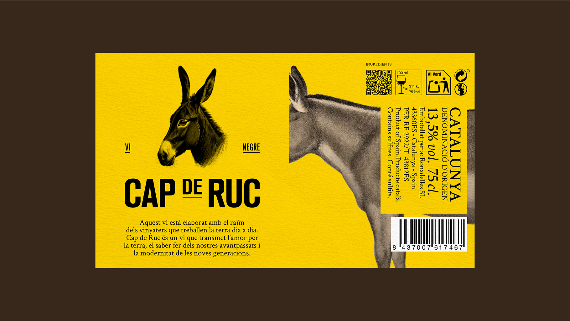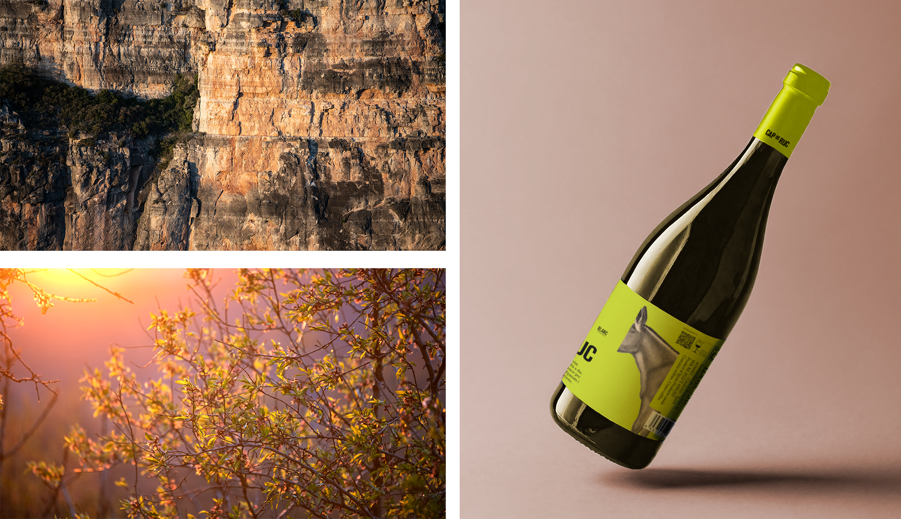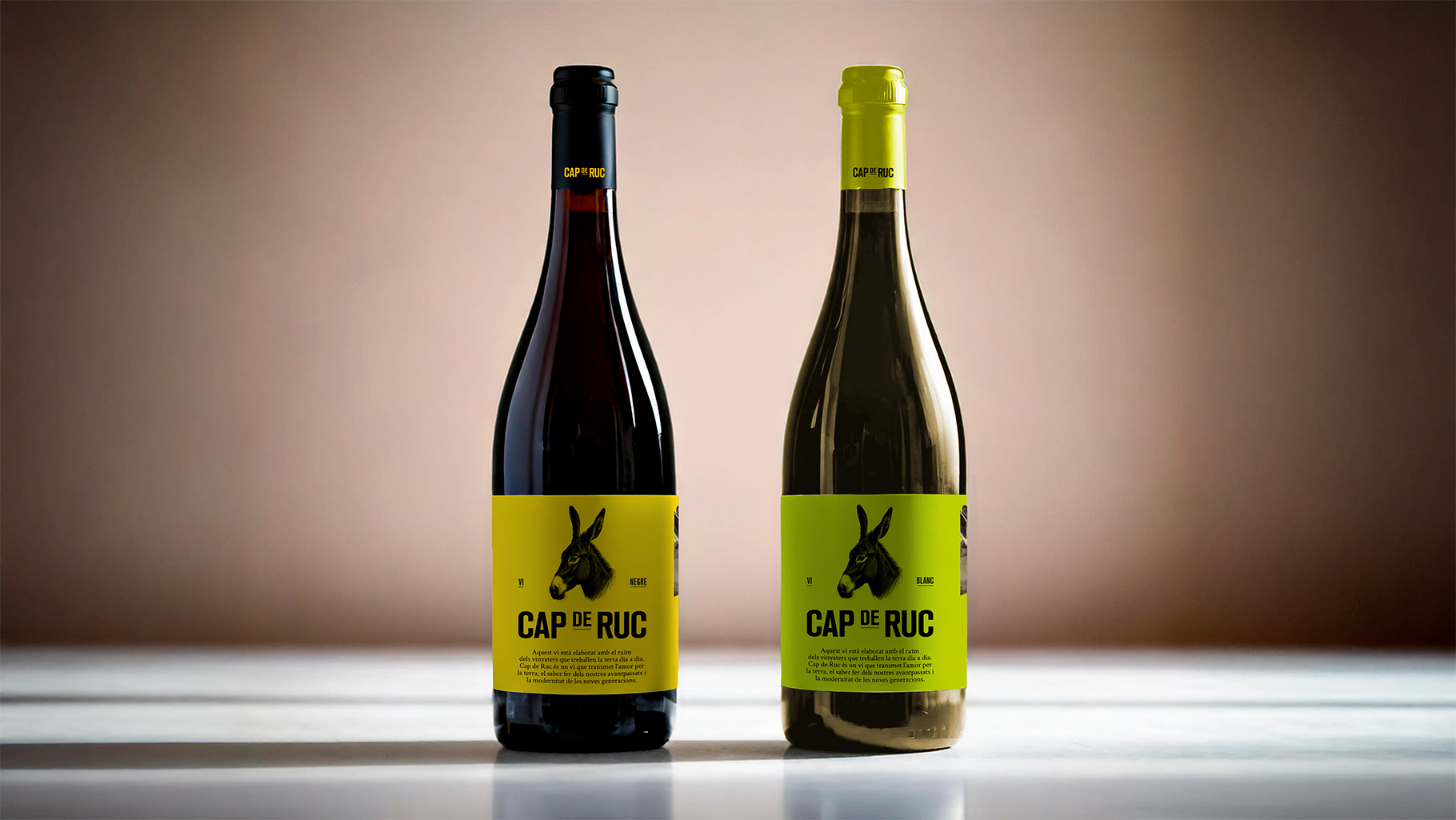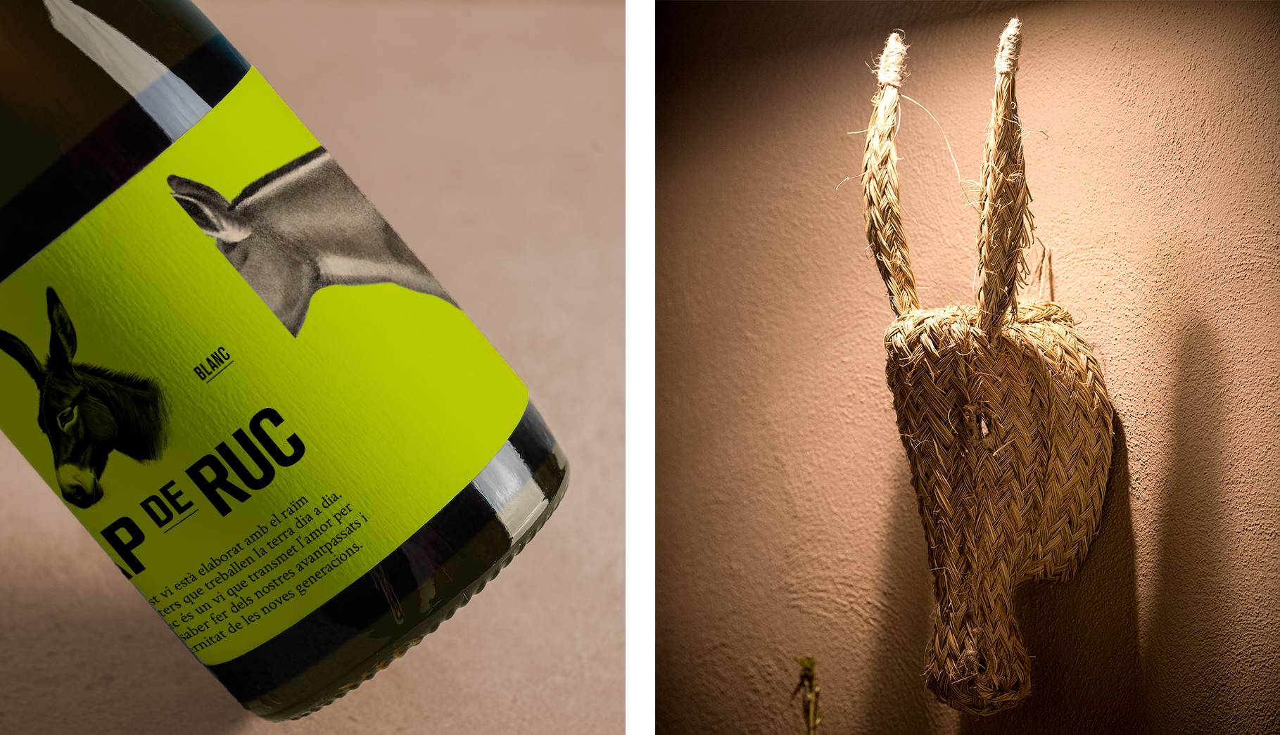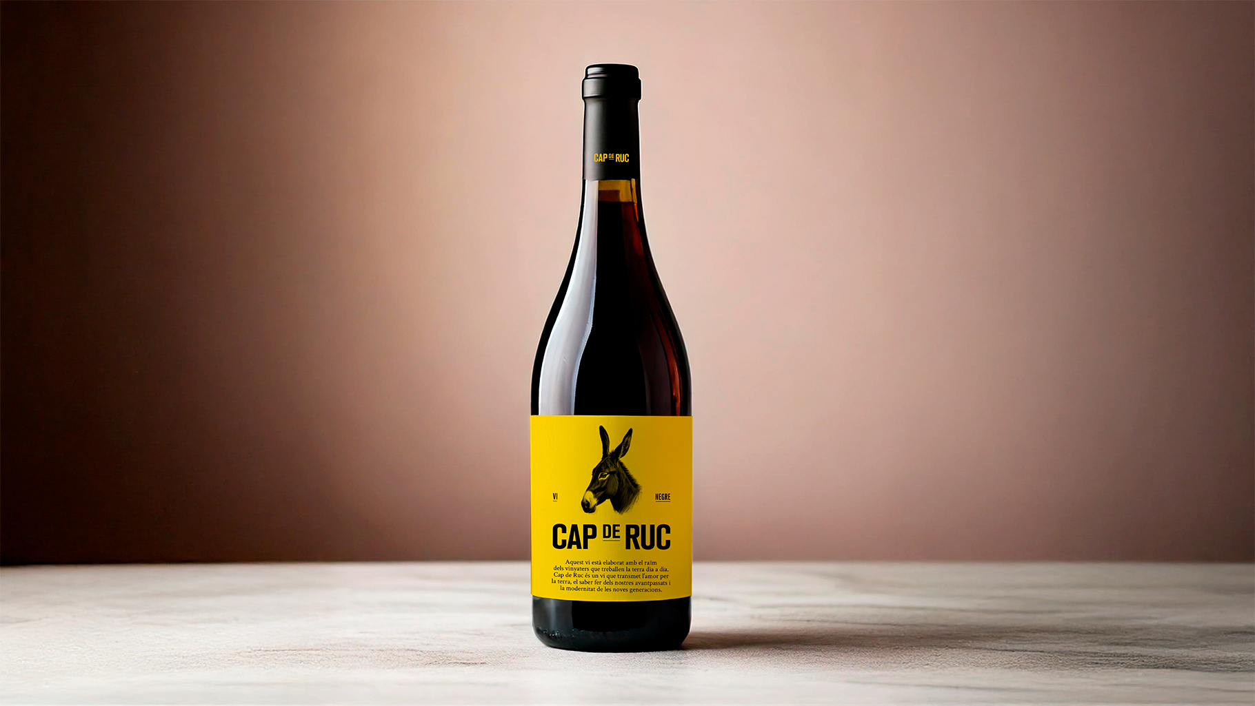
→ A smart label
When you're asked to redesign the label of one of the country's most popular wines, which also represents a significant volume of business for the client, the last thing you can do is play the fool. But that's exactly what we had to do in this project. The client wanted to begin a transition process to modernize the brand and attract new audiences, while keeping its essence intact and staying true to its origins. So, we illustrated a new version of the donkey and redesigned the label. And judging by the results, both aesthetically and in terms of sales, everyone was happy – the donkey included. Cheers.